Scrabble Olympics
Scrabble Olympics
A Fun Way to Visualize Data
A Fun Way to Visualize Data
A Fun Way to Visualize Data
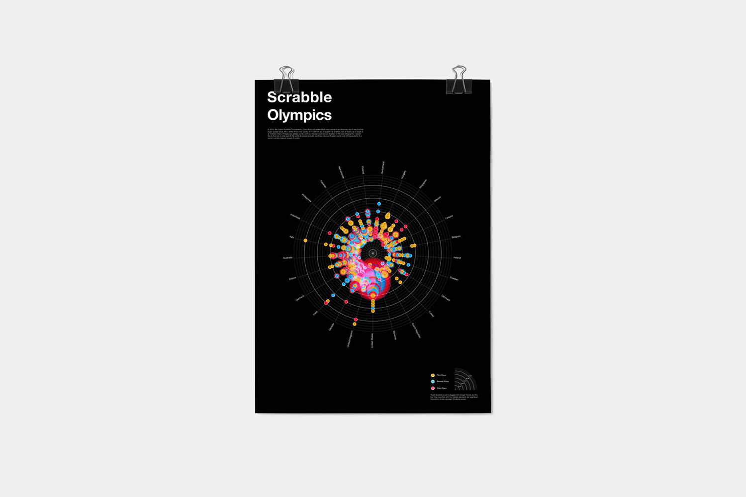
The goal of the Scrabble Olympics is to tell a visual story of the origins of new Scrabble words that are added to the official guidebook every year. I used Excel sheets to analyze the data, then translate it into a visually engaging infographic.
Insights From Google Trends
Insights From Google Trends
Insights From Google Trends
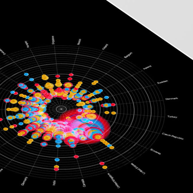
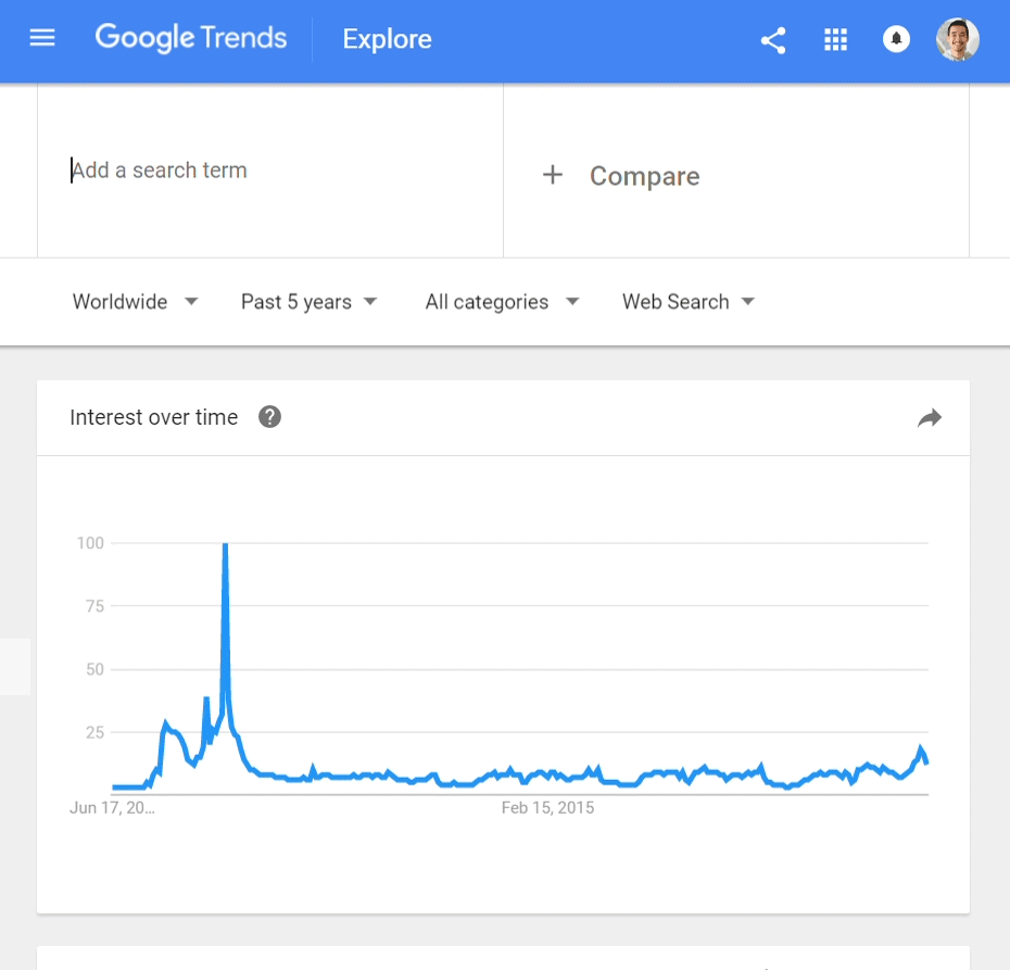
With all these unfamiliar words as the newest additions of the Scrabble dictionary, I was curious to see where they come from and where they are mostly used. Google Trends is a fantastic tool to discover the search history of a specific keyword, its popularity overtime and what region has the highest search rate. These data sets are going to be the foundation of my visual graph.

Synthesize Data
Synthesize Data
Synthesize Data
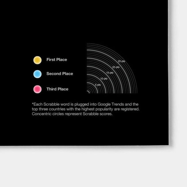
After collecting all the data from Google Trends, I imported them into excel to get a better understanding. What I need from this data set is the most popular regions/countries of a specific Scrabble word.
The top three regions were being recorded. The first place gets 5 points, the second place gets 3 points and the first place gets 1 point.